Typography + Publication
Student work
July - Aug 2020
Overview
So I finally took up a typography class finally and was excited about the outcomes and learnings from the class. Being a designer, one assumes prior knowledge of grids and typography. However, I never got a chance to formally be 'typographically educated'. This summer I took Prof. Daryl Smith's Type – 2 class and below you will see some of the outcomes of the class projects. I cannot recommend Daryl enough as a great teacher, he was engaging, thoughtful, patient, and adapted very well with the post – COVID online teaching/learning situation.
Typographical poster
The goal of this poster was to work with two quotes – one from the poem A psalm of life by Henry W. Longfellow and another a quote by Ralph W. Emerson, and combine them using two different typefaces. In addition to the text, the poster also uses a sketched abstract form of another letter form as a graphical element in the composition.
Architectural magazine design
The ask was to design a layout, design style, and sample pages for an architectural magazine. The brief also included that I use photographs that represent "space". I used photographs by the London based photographer, Nicolas Goodden. The pages include a cover page, contents page, editor's letter and a sample article for the magazine.
Typefaces Univers / Didot / Bembo
Environmental design
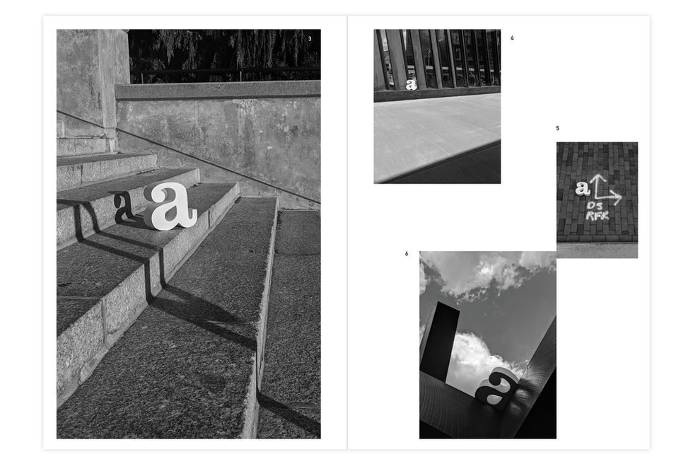
This project included creating a 3D form of any letter face form a select few typefaces. I chose to create a lowercase Clarendon 'a' using foam board and white craft paper. The next part of the exercise involved me walking around with the letter 'a' in a cityscape and capture interesting compositions. I finally compiled the photographs and the process in a Brochure that you can see below.
Typefaces Din / Garamond


