Restaurant details UX
UX Designer
Oct 2019 - Dec 2019
Three months
Design brief
In the second half of my co-op at TripAdvisor, I was tasked with reimagining the interface of restaurant details. The key problem to address was how do we accommodate and/or visualize the constantly updating information about a restaurant that will help users to take an informed decision.
How might we reorganize the relevant information about restaurants without overwhelming the end-users?
Because the design task involved many stakeholders, we divided it into smaller design tasks and conducted usability tests to make user-centered decisions. There were three micro-goals – 1) to create near term design changes, 2) to chalk out the initial groundwork for a vision concept, and 3) work with stakeholders across the Tripadvisor design systems team to explore ideas that will have an impact across various Tripadvisor products.
The design tasks were divided into:
-
Restaurant details sheet
-
Layout and information architecture
-
Navigation
-
Action items

1/ Restaurant details sheet
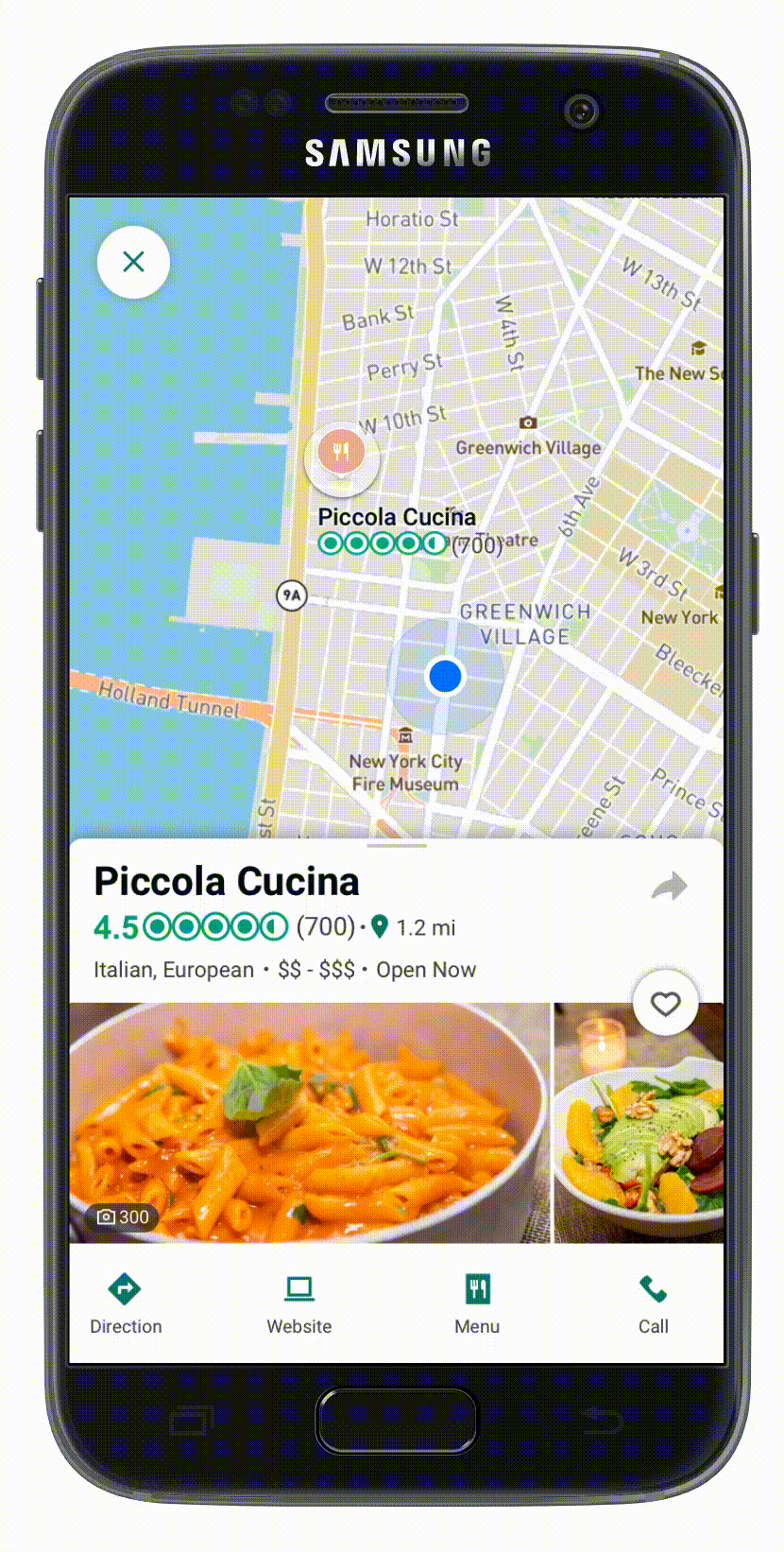
Restaurant details sheet appears when the user is accessing a restaurant through a map. Whenever a user clicks on a restaurant location, a details sheet slides in with only the most essential information for a restaurant.

(L)Primary restaurant information as seen on the sheet. (R) The sheet further contains restaurant details that can be displayed on scrolling

Prototyping
I first created paper prototypes followed by digital mock-ups to test on Usertesting.com


Paper prototyping design iterations.
Usability test
Based on our internal design critique, we decided on a single variable test of two design variants on Usertesting.com. In the first design, the details of the restaurant were placed before the photos and in the second the photos were placed before the information.
This was a think-aloud protocol with 8 users to evaluate the noticeability, clarity, and usefulness of the information layout.
Unfortunately, the details of the test cannot be shared because of NDA.
Overall, users preferred Variant I (Information and then photos) because they found that this layout provided the most important information needed for decision making (e.g., ratings, distance, open now, and price). They also found this variant to be "better organised" and have a "cleaner layout." Furthermore, they emphasized that it "visually separated the map from the photos".

Variant P(Photos, then Information)

Variant I ( Information, then Photos)
Click interaction in the task
2/ Layout and Information Architecture
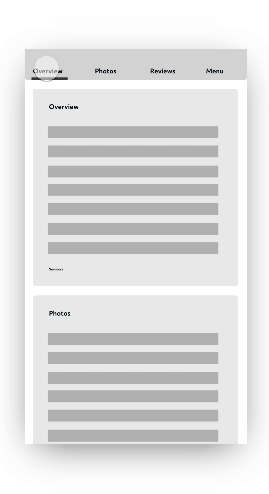
Tripadvisor stores a large amount of information on the restaurant that might be useful in users' decision-making. Thus, it was important to understand what information was most useful to the users. Here is a glimpse of all the information cards currently available with TripAdvisor restaurants.

Restaurant information cards
Usability test
In order to understand which information cards and visual layouts were most relevant to the users. Because we could not bring users for an in-person card sort exercise due to lack of resources at the time. As an alternative, I conducted a closed card sorting exercise (using visual cards) accompanied by a think-aloud protocol using Usertesting.com and Qualtrics.
The data were analyzed through a combination of qualitative and quantitative approaches.
The details of the test cannot be shared because of NDA.
Here are the high-level insights that helped shape my design decisions–
1/ The Reader vs the Glancer
This revealed two user types:
-
Readers: Those who wanted to spend dedicated time reading reviews, Q and As, menus, and other details before making a decision.
-
Glancers: Those who wanted quick answers and just glanced at the content, looking for just enough information to make a decision. Thus, they found average ratings, number of raters, and the top 3 reasons to visit the place as useful and sufficient information to make a decision.
2/ Inform, without overwhelming
On an average, participants selected 8 information cards to be sufficient information for a restaurant page.
Users want to be informed without getting overwhelmed.

Visualization and analysis fo data from the card sort exercise

3/ Navigation
In addition to the content, the page navigation needed a redesign with the introduction of new content and interaction patterns. The challenge was to keep the redesigned navigation consistent across different Tripadvisor products.
The current navigation on the restaurant details page uses tabs as a way to deep-link different sections of the same page. Clicking on the tab, scrolls to the section on the page.

Existing tab interaction on the Restaurant details page.
I also explored how different popular apps use tab navigation. While some use tabs to scale the content, others use it to navigate to other features or as a combination of both. In addition, I looked at the design guidelines for tabs in Material design and iOS UX guidelines.

Snapshot of how other apps are using the tab patterns in their navigation.
I proposed to use tabs with a combination of full-screen drill-down. Tabs will not only visually align with the current design patterns but also scale the content. This provides flexibility to accommodate new and updated information on restaurant menus. This also provides a dedicated page to restaurant reviews - an important feature of Tripadvisor. Below is a representation of how this interaction works in the app.


Proposal for a scalable tab navigation for all Tripadvisor details page.
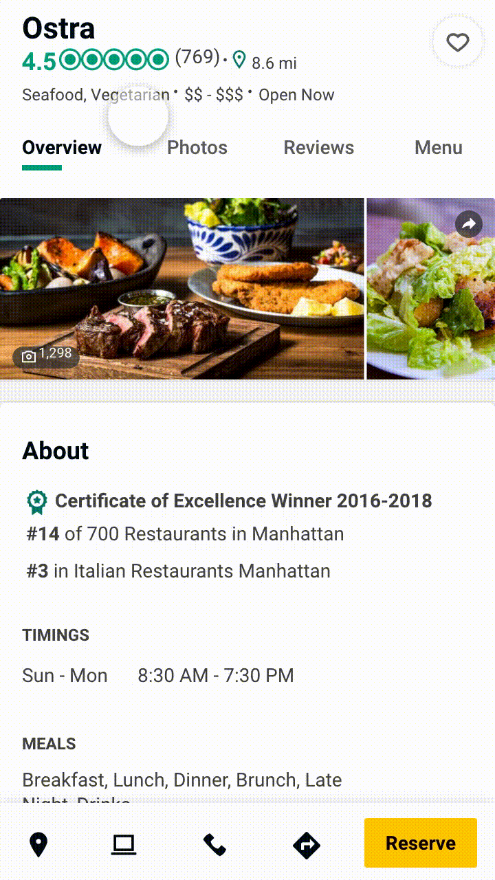
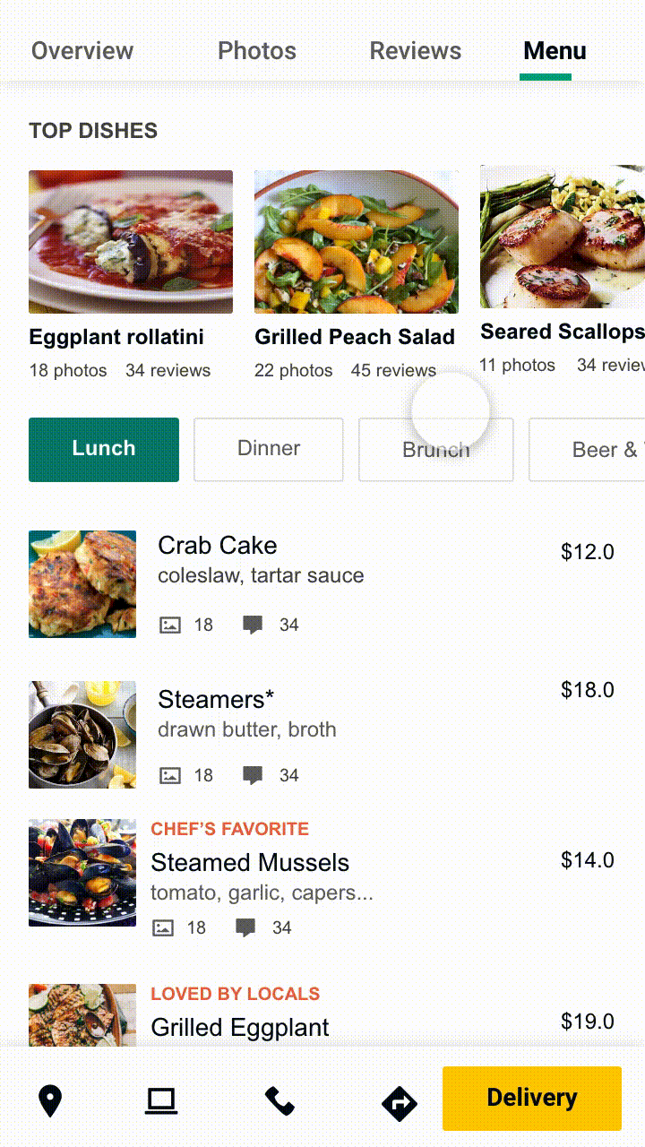
Here is how the existing information cards will be distributed in the new tab-based navigation in the app.


(L) Existing information architecture (R) Proposed information architecture with the tab-based navigation.
4/Action items
Finally, users can take actions based on their decisions. Such as they can call the restaurant, book a table, browse the menu or check the restaurant's website.

These action items are an important resource not just for the user, but also for a restaurant business. Here is how some of the competitor apps present these action items. These action items are given a prominent visual treatment on the page because of the of their importance for the user as well as the businesses.

Competitor's visual treatment of the action items on a Restaurant details page.
Here are some examples of how we could make the action items more prominent and easy to use on the app interface.

Below are two concepts for the bottom sticky buttons. Tripadvisor has global bottom navigation with in-app pages like home, trips, inbox, and user profile. It also has a FAB button that is used for content creation like add reviews and photos.
The first concept retains all of these actions on the restaurant page and combines them in a single tab.


The second concept, gives more prominence to the restaurant-related actions rather than the "global Tripadvisor navigation". In this concept, the bottom navigation is persistent and had the most important restaurant-related actions like directions, website, write a review (WAR) and/or add photos.

Another version of the second concept uses each tab and adds a contextual button. For instance, the user can see an 'add photo' button when they are on the photos tab or "add reviews" in the reviews tabs.


Visual representation of how the contextual buttons will look on each of the tab.
(L)Prototype demonstrating the tab navigation. (R) Sticky-Tab behavior on scrolling.
Reflection
This particular design exercise was broken into different independent tasks to ensure incremental progress. Here are some of m key learnings from this project –
-
Design UX patterns such that they scale for content as well as sustain the changes in UI trends overtime.
-
Have an understanding of which concepts are more low hanging fruits (like adding the action items in the details page) and which concepts will require high effort due to stakeholders requirements, high engineering cost, or user on-boarding challenges.
-
The smallest of design changes in a consumer-facing app can have significant implications. It is important to be prepared for users' reactions. For instance, removing an existing button in a new design can lead to many unsatisfied user reviews in the app stores.
-
Be innovative if you are resource crunched. For instance, in the card sorting exercise we did not have the resources to have an in-person activity (which would be ideal). We instead hacked existing tools to conduct similar study in a digital setting.
Design responsibilities:
System design, UI design, UX design, User research, Qualitative and quantitative research
Tools used:
Sketch, Invision studio, Invision prototyping, Adobe illustrator, Usertesting.com, Qualtrics