Tablet Interface for Microtasking
Product Designer, User Researcher
Nov 2020 - Dec 2020
9 Months
Background
While we were doing a research around user dropout in the annotation platform at PathAI, we had heard anecdotes that our users are using the annotation platform on their tablet.This was an interesting finding, given that we had not optimized the experience for a touchscreen device or for responsiveness – the team had assumed all users will use a laptop or desktop with a mouse as input device.
Here are some verbatim we heard from our annotator Pathologists in our qualitative study –
"I have a touch screen laptop, I find mouse is easiest for all the tasks..moving the slide using the touch screen way very efficient.."
"I use an Ipad with finger for inputs..I tried a the stylus wasn't as helpful. Sometimes at work I use my mac desktop. I find it difficult to make annotations like nuclei with my fingers which is annoying"
"I use the iPad and it's easy to draw but sometimes it freeze up sometimes and go black and have to re-login."
These findings led me to further inquire what is the current and preferred usage of devices. I sent a some questions as part of a larger survey and here is what I learnt –
Total responses : 46 (of 200)
% of active users who currently use touchscreen devices (including tablets, touchscreen laptop/desktop): 27%
% of active users who prefer to use touchscreen devices (including tablets, touchscreen laptop/desktop): 54%

Design Explorations
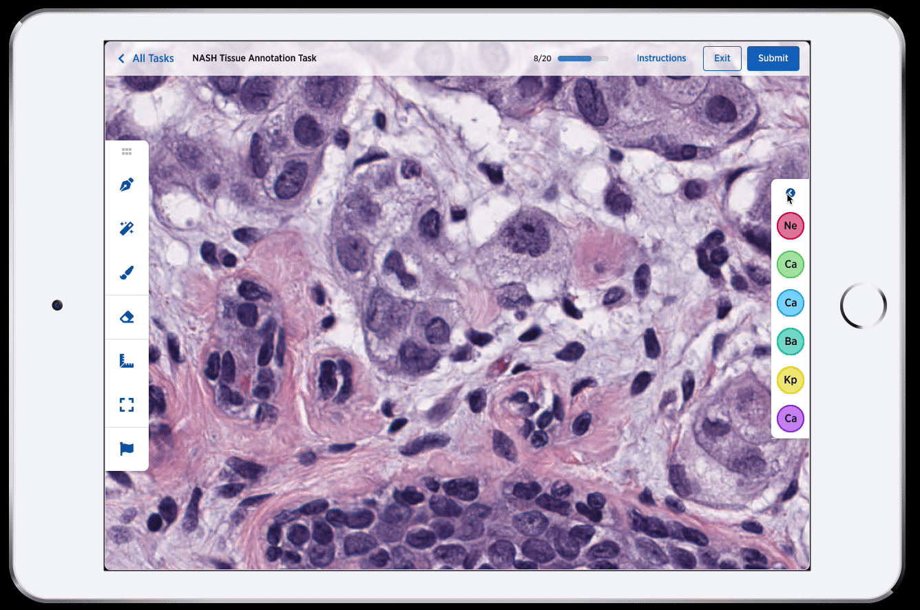
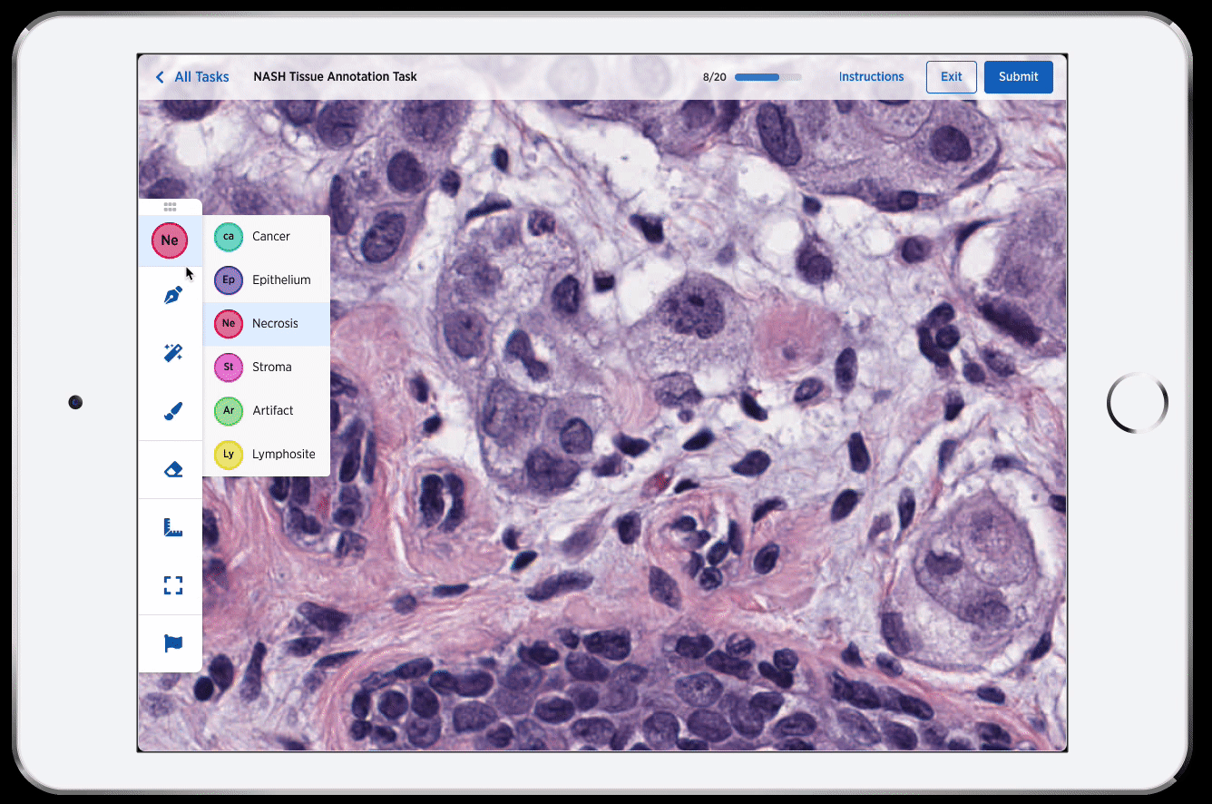
Annotation tool bar
Option A : Floating tool bar
Pros:
Cons:


Option A : Floating tool bar
Pros:
Cons:


Point Annotation
Research and Design
Empathy exercise + Surveys
Me, along with 20 internal employees at Path participated in a nuclei segmentation research experiment for another project. We made hundreds of annotations for multiple slides for ~3 hours. After this session I sent an experience survey to capture the experience of using the annotation platform in the context of making these nucleus boundary annotations.
I sent two surveys post our internal team used the annotation platform. The questions were open ended -
1. What was great?
2. What was not so great?
3. Suggest any ideas for improvement.
This exercise not only allowed the internal members to empathize with user problems, they had an avenue to voice their ideas to the product team. I also helped the team identify the gaps and opportunity areas in the product we have.
Brainstorming
I held a brainstorming session with the engineering squad along with ML stakeholders. As a pre session exercise I asked the members to use the annotation platform for a task and answer an experience survey. Then, I created this framework to help guide the brainstorming for the labelling tools-
-
Creating annotations
-
Editing/deleting annotations
-
Easily identify and remember which annotation is being made
Reflection
This was a really impactful and interesting interaction design problem that came my way and here are some takeaways from this experience -
-
Involve engineering early in the process: For this work, I wanted to generate excitement in the engineering squad about the problem at hand. I felt like the workshop with the engineers went a long way in getting engineering inputs like - it is non trivial to edit annotation with the current framework and how bit map editing is different from the vector data that we store in the database today.
-
Making Quick prototypes: I think the hacky prototype that we put together on photoshop made it very easy for stakeholders to visualize the tool and it's interactions quickly and easily.
-
Building on top of each other's ideas: This work also inspired the engineering and ML squad to invest time in more ML powered tools to make making annotations even more quick and easy.
-
Thinking about the long term design and ripple effects on the system: Because the annotation platform is highly complex and caters to many different use case, the exercise to visualizing the vision for this work in all different scenarios helped all stakeholders see where we are headed in future.
Design responsibilities:
Research, Interaction Design, Visual Design
Tools used:
Design: Figma, Photoshop
Research: Zoom, Airtable, G Forms