Traffic Analytics Dashboard
UX Designer
June 2017 - July 2018
One year
Design brief
At Microsoft, I worked as a UX Designer for Traffic Analytics, a flagship cloud-based network monitoring solution of Microsoft Azure. The goal was to design visualizations and an easy-to-use dashboard to support visual analytics of network traffic.
This was a unique experience of building a complex enterprise product experience from scratch. I helped build and ship the first public version of the product.
As the only designer working on this team, I was responsible for the initial phase of understanding the user requirements, building the information architecture for the complex diversity of content, UI flows for intermingled tasks, UI screens, and scalable visual assets.
I closely collaborated with program managers, engineering managers, front-end and back-end Engineers. I also remotely collaborated with the Azure design framework team based in Seattle.


Background
Traffic Analytics is a cloud-based solution that provides visibility into user and application traffic on cloud networks. It analyses NSG Flow Logs across Azure regions and equips users with actionable information to optimize workload performance, secure applications and data, and audit organization’s network. Overall, Traffic Analytics allows users to:
-
Gain visibility into network activity across the Azure cloud system, VNETs, and subnets
-
Identify threats and anomalous logs in VMs and network ports
-
Improve application performance by helping users plan capacities, traffic hotspots, and network flow patterns
More details can be found on the Microsoft Blog here.
How might we design a product that lets network or infrastructure administrators to create, visualize, and maintain an Azure cloud network?
Understanding Users
Traffic Analytics can be used by network, infrastructure or application administrators, to gain insights into the performance of network links, to monitor network connectivity or to identify root-cause of poor network performance.


Users can use such dashboards on their laptops or large monitors. They also juggle between multiple products to understand root cause of a network issue.
Process
Due to NDA, I cannot disclose the details of the process and the iterations, however, you can find a case-study discussing important design implications “here”.
Briefly, the process involved exploring how complex products visualize large scale data for easy consumption. Because the domain of networking was entirely new to me I first worked directly with cloud engine developers on how network monitoring is done in order to gain some domain knowledge.
Interface design
Designing the interface was an iterative and collaborative process involving daily reviews and ideation with the development and management team. This allowed me to create interfaces that improved the product and at the same time were achievable for the programming team in a short span of time.
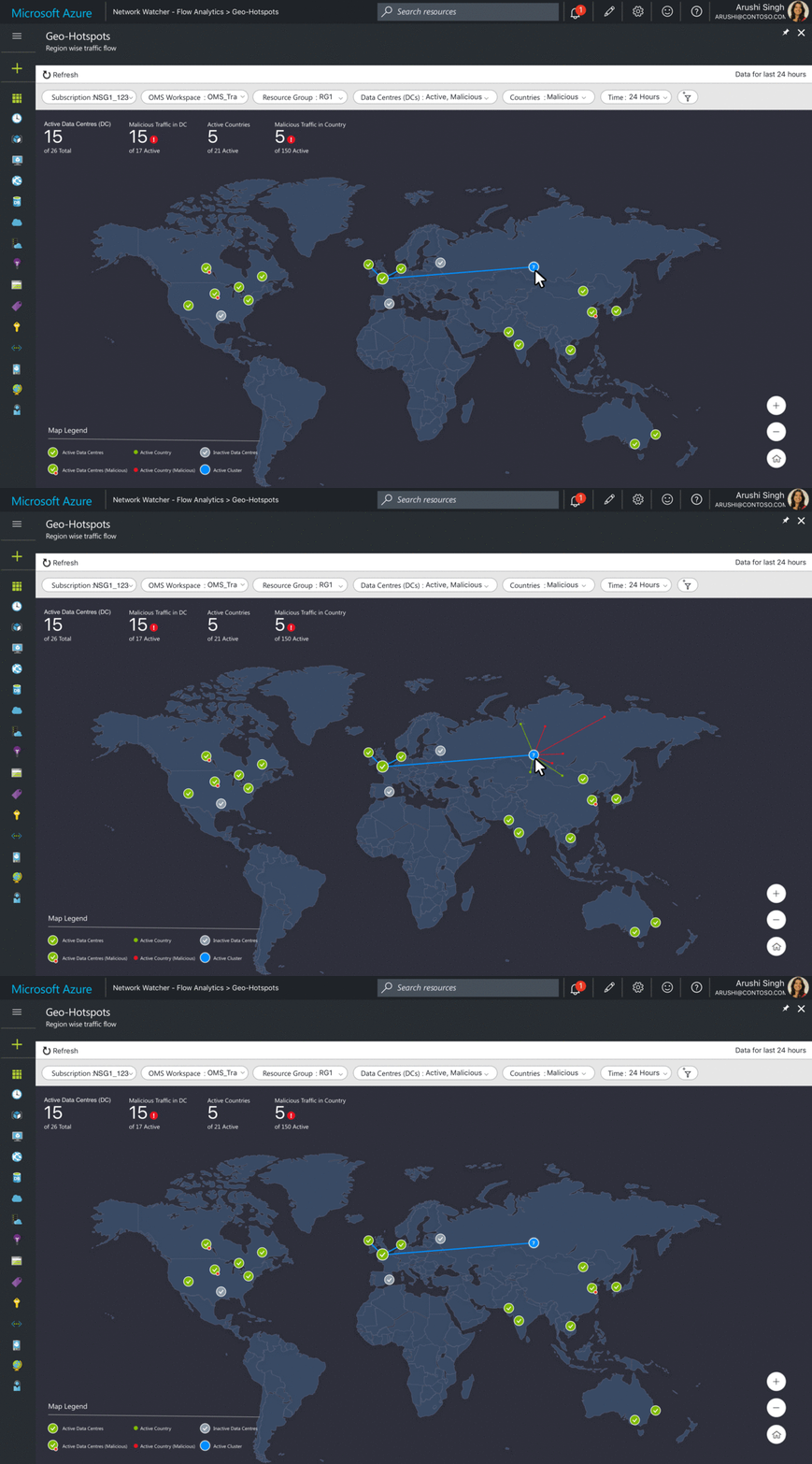
Below are few snapshots from the dashboard, geo-map visualization, and some finer UI details.

Mental model of Azure Virtual Networks
Azure Data Centres

Product user flow and key screens
Dashboard
The dashboard follows "overview first details later" approach to data visualization. Users first get an overview of the network traffic and then progressively explore details of network nodes and data pivots.


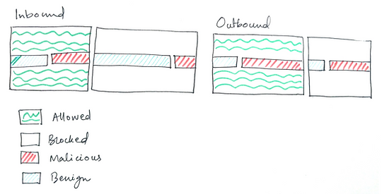
One of the first and most important visualization for a user was to see a distribution of their incoming and outgoing traffic. It was learned from user studies that while the most important information was if something was bad(Malicious traffic), they also wanted to look at the overall traffic for network management related scenarios.

This is the final visualization that was selected for the final product. It uses a clean design that uses a modified bar chart which shows the nestled traffic distribution. Below, you can see some initial iterations.

Vertical layout bullet chart

Radial donut chart
Bullet graphs to visualize the nestling.

Horizontal layout bullet chart

Stacked + Nested bar chart, left aligned
Data Center Visualizations
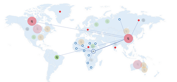
I explored different approaches to visualize the data centers (DC) on the dashboard. The primary goal was to show 'which DC is talking to which one and with how many flows'.
I initially explored heat maps and sankey plots but they were not scalable for a vertical scroll.
Eventually, I visualized these DCs on a map. When the prototypes were tested with some end-users, they also prefered the map-based representation because their task flow also requires viewing data centers with geo-tagged information. The map-based visualization were created using Bing maps API along with Azure's plotting libraries.


Day 0 Experience
The Day 0 page for the product described the key features on the home screen along with a call to action to guide the users through a "configuration" flow.

Impact
As of June 2020, Traffic Analytics uses up 474 TB Monthly log volume and has 5447 Customers. 255 of these customers are Fortune 500 customers and 48 of them fall into the top 100 Azure Customers.
Takeaways
This was my first experience of building a complex enterprise project from the scratch, especially as the only UX designer in the team. Some things I learned in the process -
-
It is good to be out of your comfort zone: Before working on this product I only had experience working on consumer-facing products which I could easily relate to as a user myself. However, designing for enterprise products is a different ball game requiring domain expertise, working with specialized users, and dealing with a lot of legacy approaches from other products.
-
Working with a remote leadership: At Microsoft India, teams often work in close conjunction with the HQ at Redmond, WA. We used many shared components and that required frequent late night calls. This not only enabled me to plan the deliveries in advance but also communicate the work effectively in virtual meetings (at different time zones).
-
Where is thy user?: Getting time from very niche users for an MVP product can be difficult. It often required me to collaborate with research teams in Redmond and to conduct remote usability studies with users across the world.
-
Be your own evangelist: Design needs a lot of evangelising in the organization. Enterprise product design might require many times more of that. I worked with a team of designers who catered to multiple products across Microsoft. This project taught me to be assertive in including design decisions as part of larger product decision-making process where incentive to change the legacy is often limited.
Design responsibilities:
User research, interaction design, data visualization, usability engineering, graphic design
Tools used:
Sketch, Figma, Invision, Adobe Illustrator, Zeplin
You can read more about my thoughts on enterprise design in my Medium Blog here.