Designing Tools to Label Images for Digital Pathology
Product Designer, User Researcher
Jan 2020 - August 2020
9 Months
Background
Reliable annotations are important for training valid machine learning algorithms. However, gathering high quality annotations on tissue samples of interest is expensive, resource intensive, and time consuming, especially when done by highly trained pathologists.
Business goals
-
To decrease the turn around time for collecting annotations from pathologists.
-
To maintain the quality of annotations received for model training.
Design goals
-
To design tools for making region annotations quick and efficient.
-
Address some known pain-points with the annotation platform – bring consistency in navigation and layout.
Stakeholders
Machine Learning Engineers + Internal Pathologists + Annotator Community Manager
Thus, how might we make it easy for annotators to completely annotate a frame in a slide.

The older design
The annotation platform, when I took over the project consisted of –
-
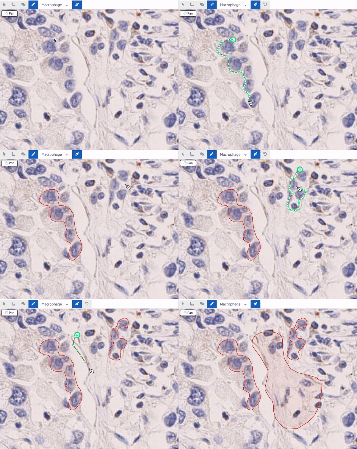
Point tool – allows pathologists to place a point at the centre of each cell.
-
Pen/Pencil – allows pathologist to draw a boundary around a region of interest.
-
Magic wand – allows pathologists to select a cell's boundary.
Here are some of the high level pain-points (anecdotes from team members user studies) with the current experience of the annotation tool
-
Annotating smaller regions within a tissue is time consuming.
-
"It’s very difficult to annotate a donut like annotation with the current tools."
-
No provisions to edit existing annotations.
-
Lacks affordances of current labels causing user errors.
-
Annotating for long hours (with a mouse/trackpad) can cause cognitive, vision and muscular strain on palms/fingers.

Point Annotation
Pen Tool

Wand Tool
Known issues with the current annotation experience
Research and Design
Empathy exercise + Surveys
Me, along with 20 internal employees at Path participated in a nuclei segmentation research experiment for another project. We made hundreds of annotations for multiple slides for ~3 hours. After this session I sent an experience survey to capture the experience of using the annotation platform in the context of making these nucleus boundary annotations.
I sent two surveys post our internal team used the annotation platform. The questions were open ended -
1. What was great?
2. What was not so great?
3. Suggest any ideas for improvement.
This exercise not only allowed the internal members to empathize with user problems, they had an avenue to voice their ideas to the product team. I also helped the team identify the gaps and opportunity areas in the product we have.


Brainstorming
I held a brainstorming session with the engineering squad along with ML stakeholders. As a pre session exercise I asked the members to use the annotation platform for a task and answer an experience survey. Then, I created this framework to help guide the brainstorming for the labelling tools-
-
Creating annotations
-
Editing/deleting annotations
-
Easily identify and remember which annotation is being made
Competitive Research
I looked into various platforms that are into data labelling in general, pathology data labelling in specific and also other drawing and annotation tools. I did a tool bench marking to analyze where we stand against other competitors and what can we further improve.
Some of my takeaways from this research included -
-
Almost all products had a version of the pen tool.
-
All products allowed editing in various input methods. Control+Z being the most common feature. However, some products had customized their editing tools to enable quick edits.
-
There were algorithm-assisted annotation tools to support precision in user annotations and improve speed.


Design Proposal
Based on all the research so far, we decided to design a brush and eraser tool to ease annotation burden. Reasons being –
-
Initial testing with internal pathologists shows that they will benefit from a tool that allows them to paint on the slide – making the task less tedious and more "fun."
-
Could be flexible for future overlay correction tasks as well.
-
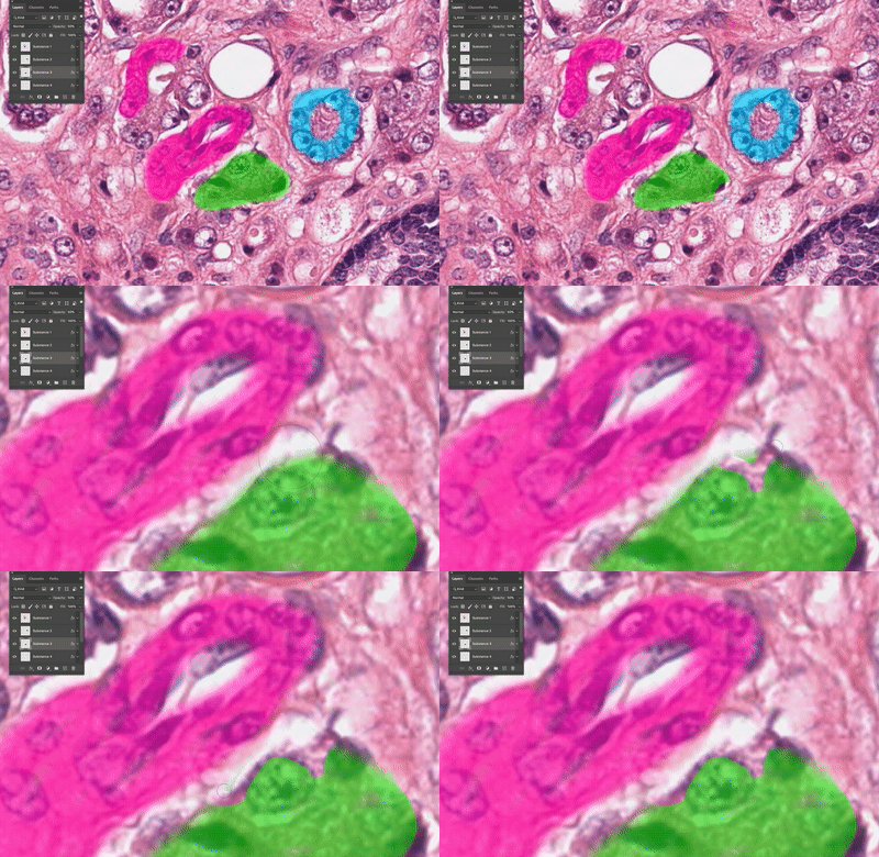
It allows for easy editing of the blob with the eraser.
-
It will be very easy to make donut like shapes using this tool – a pain point highlighted earlier.
-
It allows user to manually control the size of the brush for annotations of varied precisions.
-
It is flexible for all stains and disease indications.
-
This tool has been battle tested analogous products for drawing, painting and we could benefit from applying that learning to our product.

I also created a quick prototype in photoshop to help demonstrate the proposed interaction –

Creating an annotation
Deleting an annotation
Tool Specifications
Below is a representation of how the tool will function at a schematic level. In addition, I illustrate how the interactions will work when a user uses these tools.

Schematic of various substance 'layers'

Left Pane
The left pane is how the user will interact with the substance sections. I tried a few visual varients to showcase the substance colors before landing on the final design.


Left pane can expand and collapse to show all the 'children' annotations in a substance layer
Keyboard accessibility
One of the key feedback we heard from our internal users was how much they were able to speed up the annotation process by using keyboard shortcuts.

First time use
This will be the first time a user will have to choose a tool of their liking to make an annotation. Thus it is important that the fully understand how the tool works to improve the learning experience.

Page Layout and Navigation
They key design challenge with the page layout for this experience was -
-
How do we make the annotation viewer's layout, particularly the header and left pane more consistent with the Clinical Viewer?
-
How do we maximize the space for viewing the slide and annotating on it since that is the primary task for the user when they are making annotations?


Two approaches to the page layout. We finally decided to go with one to maintain consistency among all PathAI viewers that Pathologists will be interacting with.
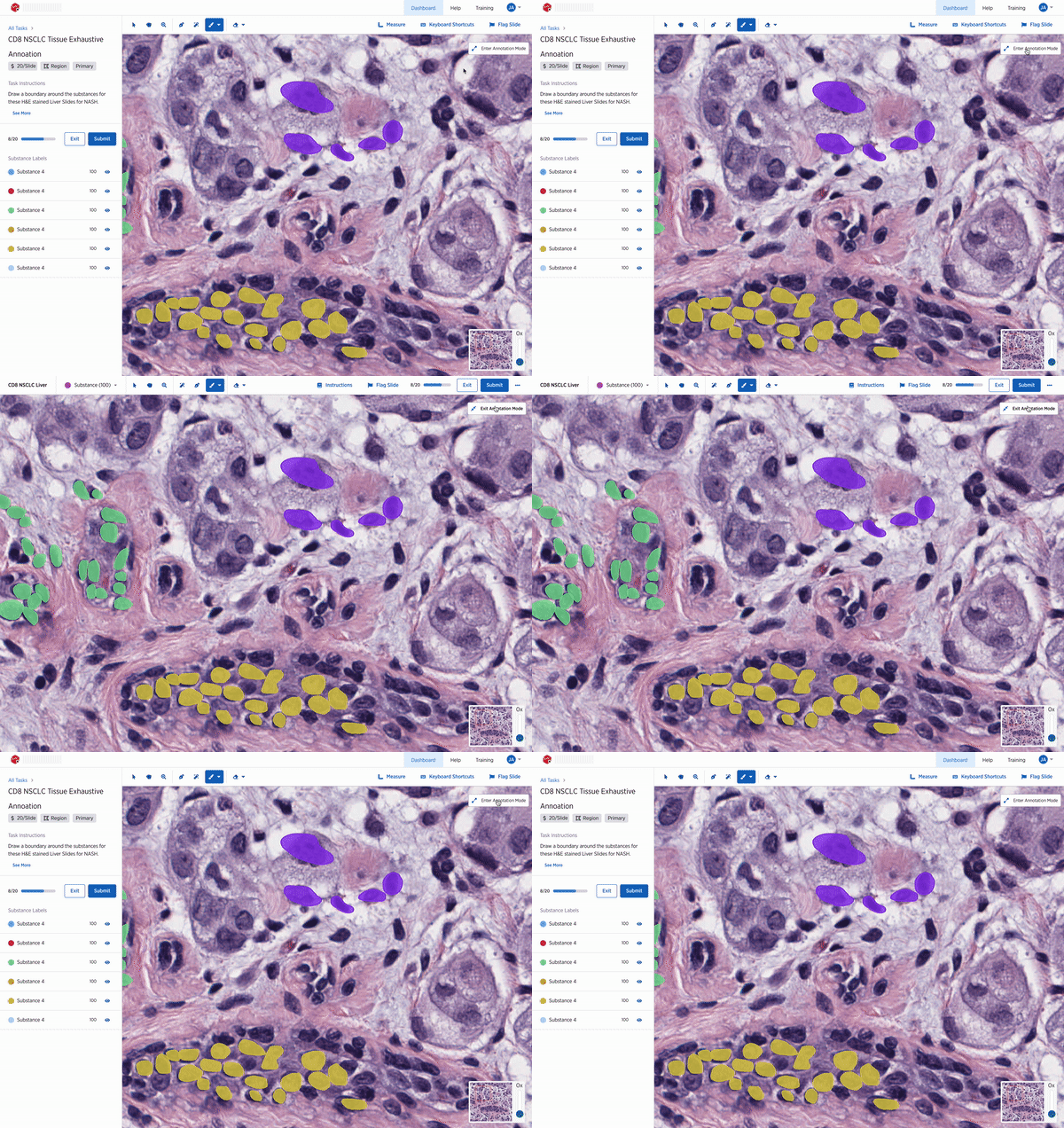
Annotation mode interaction
Tablet Experience
While the current product is not optimized for tablets, we have heard anecdotally a large number of our users use a tablet. I explored a very rough version of what that could look like.


Two explorations for a tablet experience, the design on the left shows and expanded substance module and on the right, collapses all information on the right in a top menu. The designs have a floating menu for all the tools available for the user to make annotations.
Headers
Since the annotation tool would sit inside the tool bar, I saw this an opportunity to think about the various headers in the product and how they would all live together.

Various headers on the page

Details of the brush and eraser tool on the tool bar
Additional Scenarios
On the annotation platform we have many different types of tasks and use case. Along with this work, I wanted to ensure that the designs scale for all those differnt use cases as well.
Development
This is an ongoing project but we have working prototypes that we are testing with our users.

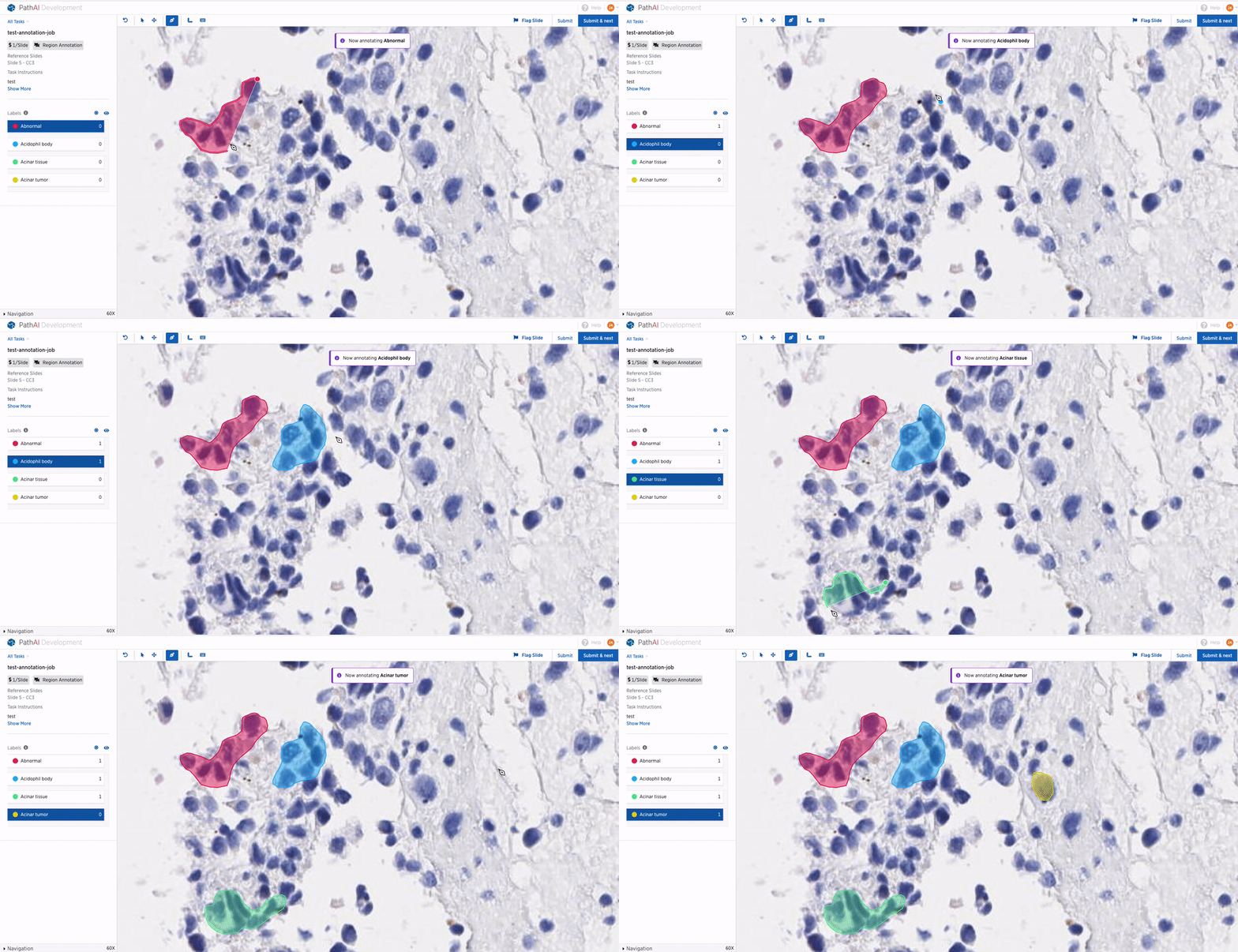
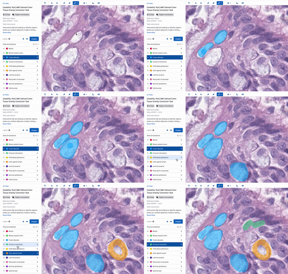

Usability Research
Reflection
This was a really impactful and interesting interaction design problem that came my way and here are some takeaways from this experience -
-
Involve engineering early in the process: For this work, I wanted to generate excitement in the engineering squad about the problem at hand. I felt like the workshop with the engineers went a long way in getting engineering inputs like - it is non trivial to edit annotation with the current framework and how bit map editing is different from the vector data that we store in the database today.
-
Making Quick prototypes: I think the hacky prototype that we put together on photoshop made it very easy for stakeholders to visualize the tool and it's interactions quickly and easily.
-
Building on top of each other's ideas: This work also inspired the engineering and ML squad to invest time in more ML powered tools to make making annotations even more quick and easy.
-
Thinking about the long term design and ripple effects on the system: Because the annotation platform is highly complex and caters to many different use case, the exercise to visualizing the vision for this work in all different scenarios helped all stakeholders see where we are headed in future.
Design responsibilities:
Research, Interaction Design, Visual Design
Tools used:
Design: Figma, Photoshop
Research: Zoom, Airtable, G Forms


